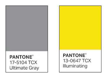
That was really worth waiting for! For 2021, the Pantone Color Institute elected, not just one colour as usual, but two! The reason for this double choice? As Leatrice Eiseman, Executive Director of the Institute explains: "this is a color combination that gives us resilience and hope. We need to feel encouraged and uplifted; this is essential to the human spirit."
A bit of history
Pantone is a company based in Carlstadt, New Jersey, USA. The concept of the "Pantone Color of the Year" dates back to the year 2000. Twice a year the company hosts, in a European capital, a secret meeting of representatives from various nations' color standards groups. After two days of debate, they chose a colour for the following year. Then the result is published in the Pantone View which professionnals purchase to help guide their designs and planning for future products.
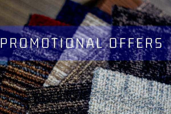
The duo we didn’t expect: grey and yellow
Ultimate gray and Illuminating, here are two colours that we wouldn’t have necessarily put together... And yet, it works!
Why does it work?
Greys are by definition colour values which create contrasts. In the Plastic Arts, they are generally used to define light and shade zone, allowing to emphasize volumes. Greys are cold and passive shades that evoke stability, sobriety, or even seriousness. On the contrary, a bright yellow tone like Illuminating suggests joy, fantasy and rhythm.
Grey and yellow combination is rather daring and at the same time very judicious because the antagonism between these contrasting colours gives rise to a dynamic, not only visual but also emotional, that no one remains indifferent to.
How should them be combined?
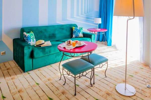
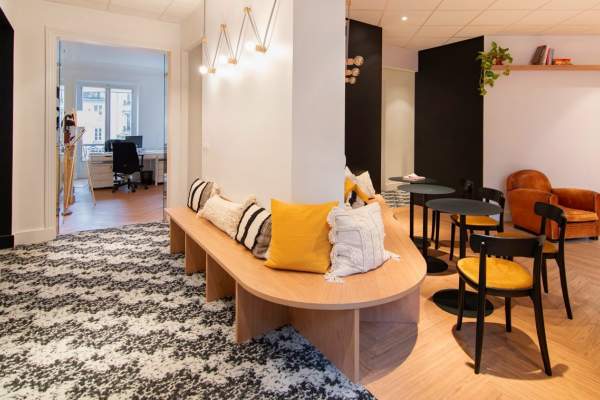
It goes without saying that the two colour references are not to be used in equal proportion. One of them can be used as the main theme, the other one coming to punctuate it with small touches. It will depend on the type of atmosphere to be created, rather soothing and classic or stimulating and avant-garde.
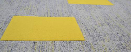
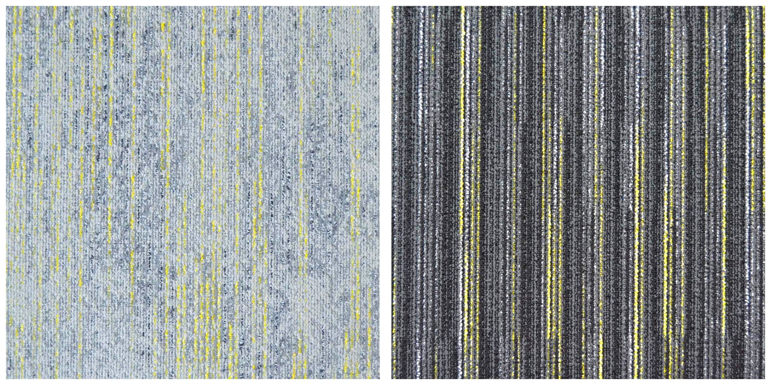
For the flooring, the configurations based on this combination are infinite. TecSOM catalogue is full of collections offering references in these two colours, plain or bi-coloured, such as TecSOM ILLUSION 113 or TecSOM LINEAR SPIRIT LIGNÉ 319.
Moreover, the 50x50 cm tile format, which can be easily cut if necessary, makes it easy to create colorful compositions on the floor.
As Leonardo da Vinci quite rightly pointed out in his time:
“Art is 1% inspiration and 99% perspiration.”
Now it’s your turn to play for the remaining 1%!
A bit of history
Pantone is a company based in Carlstadt, New Jersey, USA. The concept of the "Pantone Color of the Year" dates back to the year 2000. Twice a year the company hosts, in a European capital, a secret meeting of representatives from various nations' color standards groups. After two days of debate, they chose a colour for the following year. Then the result is published in the Pantone View which professionnals purchase to help guide their designs and planning for future products.
The duo we didn’t expect: grey and yellow
Ultimate gray and Illuminating, here are two colours that we wouldn’t have necessarily put together... And yet, it works!
Why does it work?
Greys are by definition colour values which create contrasts. In the Plastic Arts, they are generally used to define light and shade zone, allowing to emphasize volumes. Greys are cold and passive shades that evoke stability, sobriety, or even seriousness. On the contrary, a bright yellow tone like Illuminating suggests joy, fantasy and rhythm.
Grey and yellow combination is rather daring and at the same time very judicious because the antagonism between these contrasting colours gives rise to a dynamic, not only visual but also emotional, that no one remains indifferent to.
How should them be combined?
It goes without saying that the two colour references are not to be used in equal proportion. One of them can be used as the main theme, the other one coming to punctuate it with small touches. It will depend on the type of atmosphere to be created, rather soothing and classic or stimulating and avant-garde.
For the flooring, the configurations based on this combination are infinite. TecSOM catalogue is full of collections offering references in these two colours, plain or bi-coloured, such as TecSOM ILLUSION 113 or TecSOM LINEAR SPIRIT LIGNÉ 319.
Moreover, the 50x50 cm tile format, which can be easily cut if necessary, makes it easy to create colorful compositions on the floor.
As Leonardo da Vinci quite rightly pointed out in his time:
“Art is 1% inspiration and 99% perspiration.”
Now it’s your turn to play for the remaining 1%!